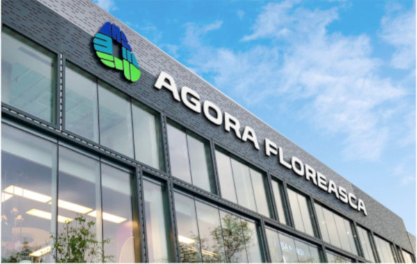
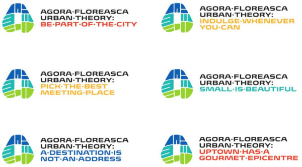
The innovative and witty brand identity created by Brandient for Agora Floreasca gourmet mall was awarded a Graphis Silver Award, and it is featured in the Graphis Design Annual 2020.
The Agora logo was also recognized with a Honourable Mention in the same contest. The identity was created by Brandient’s youngest designer, Ciprian Robu, under the creative direction of Cristian ‘Kit’ Paul.
Agora Floreasca is an urban destination project in the heart of Bucharest — an intimate, gourmet-driven “indie mall” offering a mix of authentic and unique services and entertainment. The name Agora speaks about city gathering, and the assignment was to design a visual identity to honour both the name and the location.

The brand’s logo design was inspired by the project’s geographical positioning within the heart of the city — the initial letter of the brand’s name (A) was superposed over the actual street map of the area, embracing the central location of the venue — hence making it a point of reference in community’s emotional geography.
The memorable logo enjoys a central figure in the branding applications — from stationery to larger than life fascia to OOH communication — complemented by powerful typography and understated signage inspired by the typeface.

The slogan “Urban Theory” lends curatorial authority to the brand, and it’s a statement of the brand’s promise for unique shopping, gourmet and entertainment experiences.
The project under the new identity proved to be a success even pre-opening, with available spaces rented out in record time, and it’s become a vibrant urban gathering venue attracting upscale, educated, quality time lovers.
For more than 60 years, Graphis has become an international bastion of excellence in design and visual imagery, and has published its now famous Annuals, becaming one of the classiest design publications available. Over the past decade, Brandient won 17 Graphis Awards, including one Platinum and two Gold Awards.
See the full case study on our website.


